Nature Color Palette for Fine Artists
There is a moment that almost every artist knows. You are outside, walking slowly, and a color stops you. A patch of moss after rain. A stone lit by low sun. A wildflower in a place you did not expect.
That moment is the oldest art lesson in the world. Long before paint was mixed in tubes, artists learned color from the world around them. The cave painters used earth. The Impressionists watched light shift on water and trees. The Hudson River School painted American wilderness the way it felt to stand in it.
I think we forget this sometimes. We scroll through color palettes on screens. We buy the latest set of bright acrylics. We look for the perfect mix. But the truth is, the best nature color palette is the one you find by looking at the ground.
In this article I want to share 22 nature color palettes I have collected on Pinterest. They are ready to use in your own fine art. Each one is from a real place, a real moment, a real bit of nature. I will also share the 3 step method I use to build my own palettes from the world around me. And, if you read to the end, I will tell you how to make any of these palettes feel like your own.
If you are a fine artist who wants palettes that feel balanced, calm, and connected to the real world, this is for you.

Greens and Foliage
I have grouped these 22 palettes into 4 main categories, plus 2 wildcards at the end. Each one is a Pinterest pin from my own collection. Click through to see the full visual.
Greens and Foliage
A nature color palette built from green is one of the most useful things a fine artist can have. Greens calm a painting. They ground abstract work. They let other colors sing.
1. Sage and friends — soft sage, dusty cream, gentle green, off white, warm grey. A calming palette for portraits and still life.
Why fine artists turn to nature for color
The first painters had no other choice. They used what they found. Red from iron oxide. Yellow from ochre. Black from charcoal. White from chalk. These are still the most reliable colors in any palette today.
When the Impressionists came along, they took this idea further. They went outside and painted what light was actually doing, not what the studio said it should do. Monet painted the same haystack ten times to catch one color. Pissarro painted the same road in snow and in sun. They were not inventing color. They were listening to it.
I think that is still the most important lesson for fine artists today. A nature color palette is not a trend. It is a return to the source.
There is also a quieter reason many of us turn to nature now. As eco conscious artists, we care about what our materials are made of. We do not want harsh synthetics when something softer will do. Nature gives us color that is already balanced. It does not shout. It does not compete. It just is.
When I work with palettes drawn from nature, my paintings feel more grounded. The colors sit together as if they belong. There is less fighting on the canvas. More harmony.
How to build a nature color palette in 3 steps
The 22 palettes below are ready to use. But I also want to teach you the method I use, so you can build your own.
Step 1. Observe. Go outside, pick one scene, and sit with it for 15 minutes. Do not take a photo yet. Just look. Notice which colors repeat. Notice which one pulls your eye.
Step 2. Sample. Now take a photo, or pick up a small piece of the scene. A leaf. A stone. A bit of soil. Bring it home with you.
Step 3. Choose 5 colors. If you photographed it, use a color picker to pull 5 hex codes. If you brought a physical sample, mix 5 paint swatches that match what you see.
That is it. You have just built a nature color palette from your own local environment. The same method works in any country, any season, any climate.
For me, the colors I find in Helsinki are very different from the colors I knew growing up near the Ural Mountains. Each place has its own palette. The work of an artist is to listen to the place you are in.
Note: palettes from Pinterest. Some images may be AI made. Tap to open the original pin.
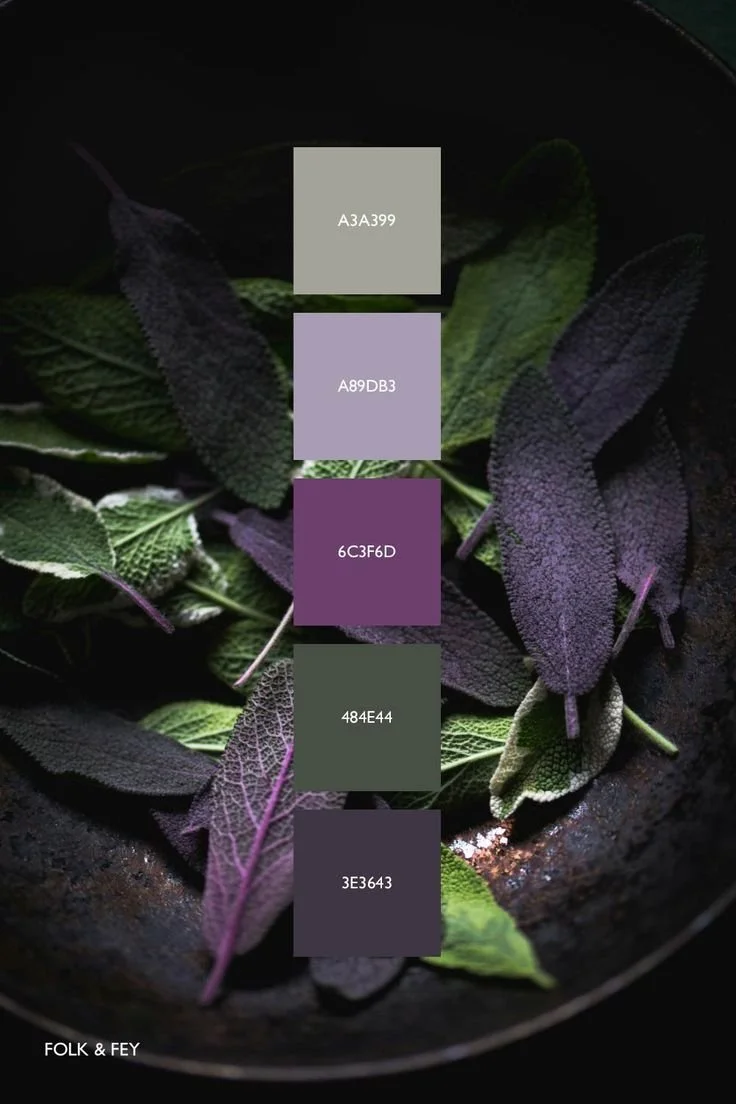
2. Purple sage — muted purple, sage green, cream, soft lavender, deep plum. A surprising nature color palette for moody landscapes and abstract work. The purple makes the green feel richer.

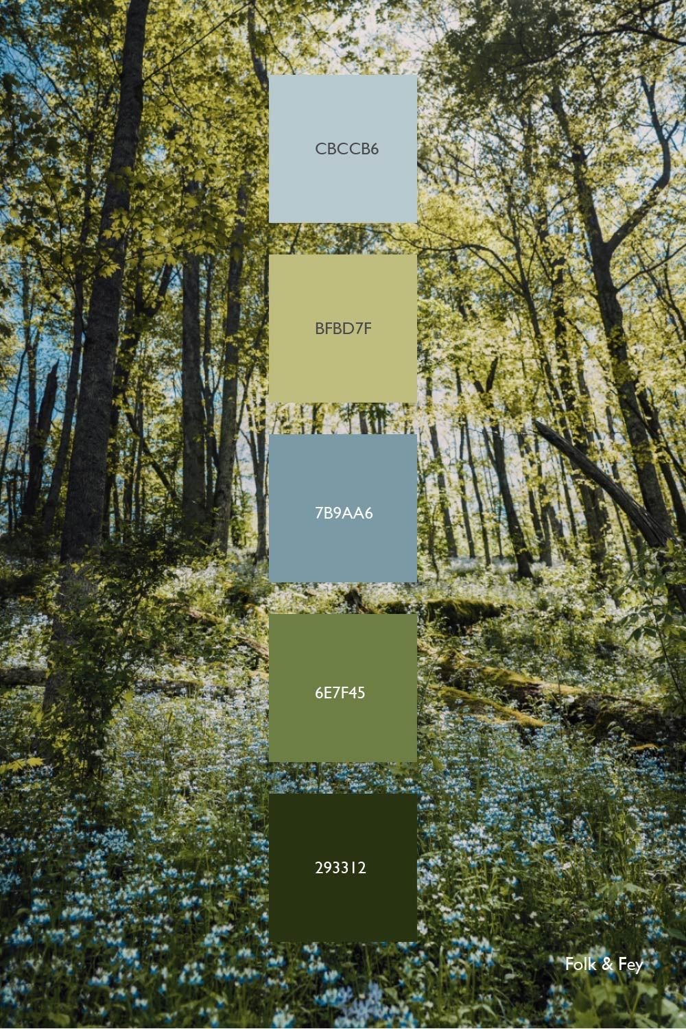
3. Spring green — fresh leaf green, soft yellow, cream, sky blue, light pink. A bright nature color palette for spring paintings and floral studies. Use it for first blooms and fresh mornings.

4. Classic green — forest green, moss, bark, cream, soft black. A timeless nature color palette for any woodland scene. This one never goes out of style.
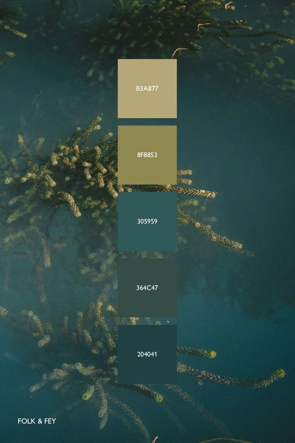
5. Aquatic green — sea green, soft teal, sand, deep blue. A moody nature color palette for water and coast scenes. Great for Baltic sea paintings.
Pinks and Florals


1. Pink coastal wildflower — soft pink, sage, sand, white, sea blue. A dreamy nature color palette for seascapes and florals. The mix of pink and blue feels like summer wind.
2. Summer pink — bright pink, cream, soft coral, white, light green. A cheerful nature color palette for warm summer light. Use it for garden scenes and floral still life.
3. Watermelon — bright pink, soft red, mint green, white, soft black. A bold nature color palette for statement still life. The contrast is strong but not loud.
4. Pear fruit — soft green, cream, blush, light yellow, off white. A subtle nature color palette for delicate subjects. Perfect for fruit studies and gentle portraits.
5. Blooming soon — soft lavender, cream, sage, dusty pink, white. A gentle nature color palette for early spring work. Good for moments just before color arrives.


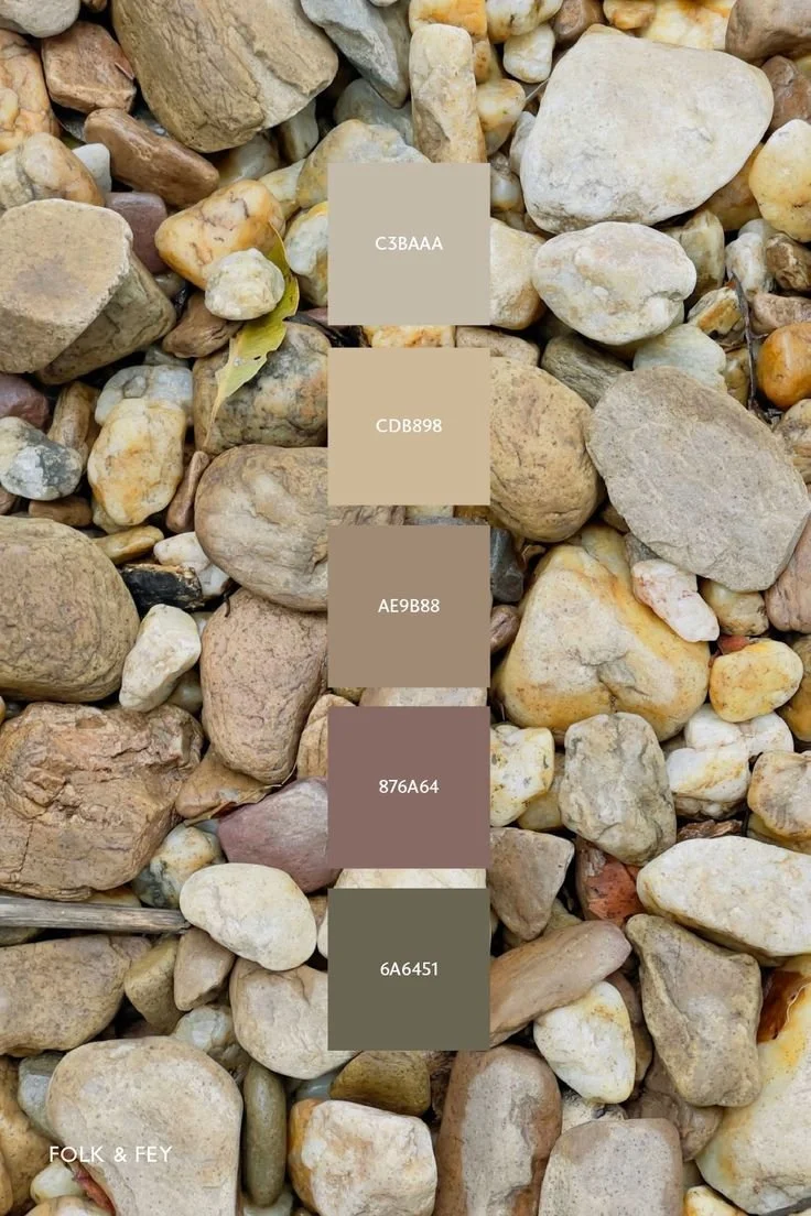
Stones and Earth
Stones are the most underused source of color in fine art. They are quiet. They are slow. They have been there for thousands of years. These 5 palettes show you what stones can teach us.
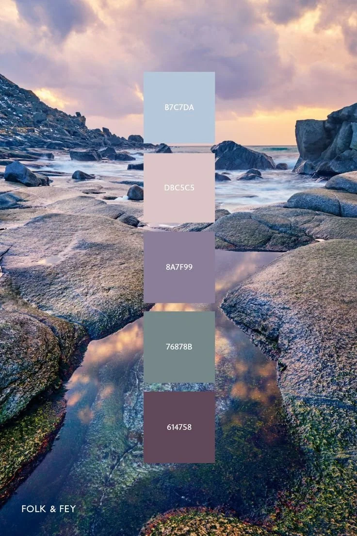
1. Purple rockpool reflection — deep purple, sea green, soft grey, white foam, dark blue. A mysterious nature color palette for water and stone scenes. The purples and greens are unexpected together.
2. Rocky beach — stone grey, soft sand, deep blue, white, brown. A grounding nature color palette for coastal landscapes. This one feels honest and simple.
3. Stone lichen — soft green, grey, stone, cream, dark moss. A textured nature color palette for organic surfaces. Lichen is one of my favorite subjects because it lives at the edge of green and grey.
4. Stone pebble — soft greys, off white, beige, deep stone, cream. A quiet nature color palette for minimalist compositions. Use it when you want less to feel like more.
5. Sands — pale sand, deep ochre, cream, soft white, golden brown. A warm nature color palette for desert and beach themes. The ochre is the soul of this palette.
Landscapes and Seasons
A good landscape palette can carry an entire body of work. These 5 palettes give you a starting point for any season or mood.
1. Dune grass — soft green, sand, cream, sky blue, off white. A breezy nature color palette for open landscapes. The mix feels like a long walk with the wind on your face.
2. Foggy forest — soft grey, deep green, mist, dark brown, white. An atmospheric nature color palette for moody woodland scenes. This is my favorite palette for moody days.
3. Irish countryside — moss green, stone, soft sky, brown, white. A gentle nature color palette for green rolling landscapes. Even if you have never been, you can feel it.
4. New Zealand — deep green, soft blue, stone, cream, rust. A wild nature color palette for remote nature. Use it for landscapes that feel untouched and ancient. (Note: spelled zealand here, the country is New Zealand.)
5. Winter — soft white, grey, deep blue, charcoal, cream. A quiet nature color palette for cold, still scenes. This is the palette of breath on cold air and snow on stone.


Wildcards
Sometimes a palette breaks the rules. These 2 are my wildcards. Use them when you want to surprise the viewer.
1. Dried herbs — sage, dusty olive, soft cream, brown, terracotta. A warm nature color palette for botanical studies. The kind of palette that smells like a kitchen garden.
2. Blue fungi — soft blue, deep navy, grey, white, soft teal. A surreal nature color palette for imaginative nature scenes. Blue fungi are real. They glow in dark forests. The palette is too.


How to use these palettes in your own art
The 22 palettes above are starting points, not rules. A nature color palette works best when you make it your own. Here is how I do it.
First, pick ONE palette that pulls you in. Do not try to use all 22. Sit with the one that makes you feel something. The right palette will feel like a friend you already know.
Second, mix 2 or 3 colors from the palette on your canvas and see what happens. Do not pre plan the whole painting. Let the colors lead you. Nature is not careful. Nature experiments.
Third, try the one color trick. Choose one color from the palette and make it the first mark on your canvas. Let everything else grow from that single choice. This is the method I use in my own practice and it has changed my work.
If you are a beginner artist, do not worry about copying the colors exactly. The Pinterest pins are guides, not rules. The point is the feeling, not the hex codes.
What is a good nature color palette for fine art? It depends on your subject, but greens and earth tones are the most timeless. Look at any old master and you will see this is true.
Can I use these palettes with acrylic or oil paint? Yes. All 22 palettes work with any paint medium, including watercolor, gouache, pastel, and ink.
Where can I find more nature color palettes? I save mine on my Pinterest board, and I share new ones in my monthly newsletter. You can also build your own using the 3 step method in this article.
A small note before you go
I started collecting nature color palettes a few years ago, after a long walk on a Finnish beach. The stones there were so quiet, so balanced, so honest. I wanted to bring that feeling into my work. So I started saving palettes from every walk, every trip, every quiet hour outside.
That is how the 22 palettes in this article were born. They are not perfect. They are not rules. They are small gifts from the world to your art.
If you try one this month, write to me and tell me which one you chose. I would love to hear.
Shape Change and connect with a community of artists who share your passion for ecological art and sustainable crafts. Share this article:

Author: Veronika Kvitko, known as Vegesent, is a multidisciplinary artist whose work explores environmental responsibility and animal visibility through conceptual approach.
She serves as the head of sustainable development and art education in Helsinki International Artists Association.

library for eco-mindful artists
Explore my free, easy-to-follow library created for eco-mindful artists. Find step-by-step guides, sustainable art ideas, and eco-friendly material tips — all in one thoughtfully curated space. Whether you’re starting your ethical art journey or refining your sustainable practice, this resource is here to support you.